Using Colour
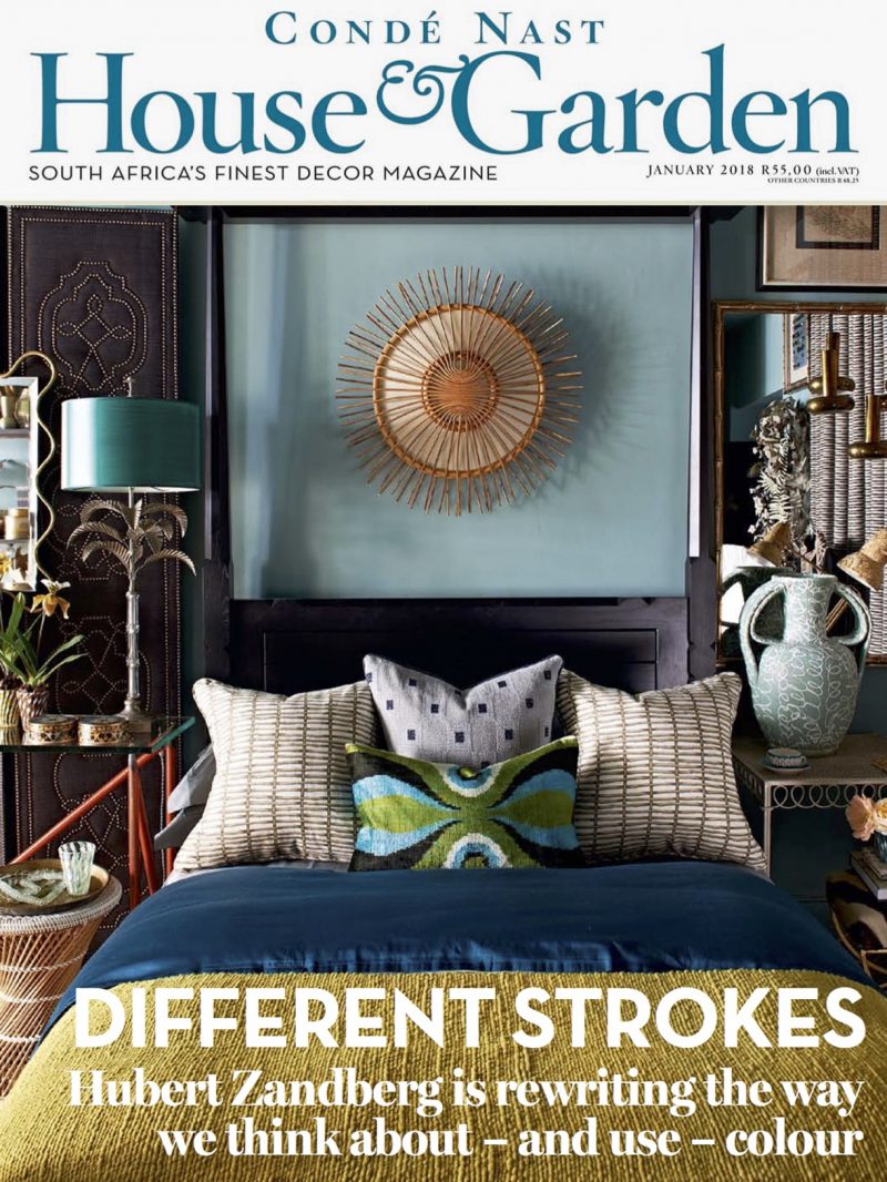
‘Hubert Zandberg is rewriting the way we think about – and use – colour’
Conde Nast House & Garden SA
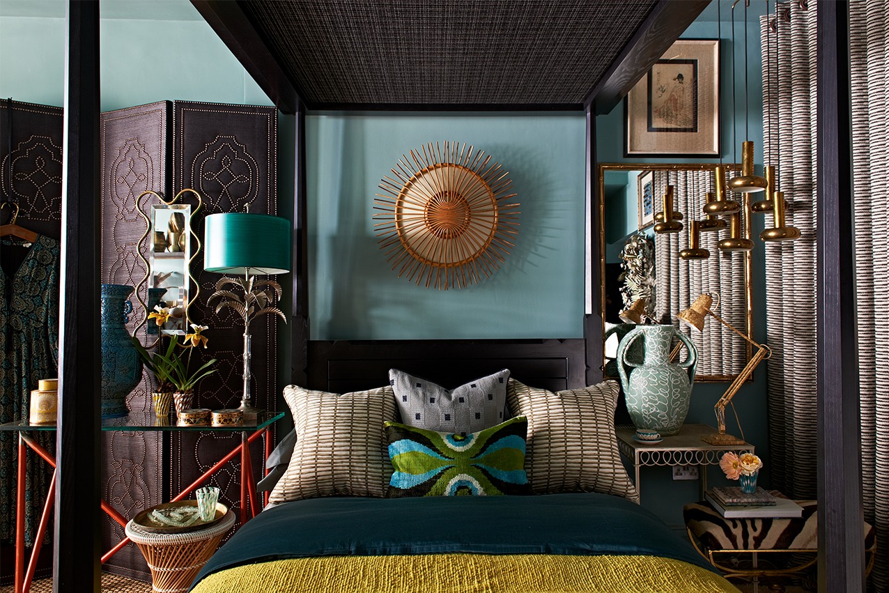
One of HZI’s trademarks is an infusion of bold colour within our interiors. A recent article in Conde Nast House & Garden SA looked at how Hubert Zandberg masterfully creates this sense of colour and how it is a both a meticulous and an edited study of the elements within the room, their context, which are combined with a sophisticated balance of composition, lighting, texture and layering. Colourful hues, tones and contrasts play a key part in unifying a space and creating its individualism, atmosphere, mood and focal points.
Below are excerpts from Piet Smedy’s article citing HZI projects and some of the tenets of HZI’s style and philosophy on the use of colour and how to create rooms saturated in colour.
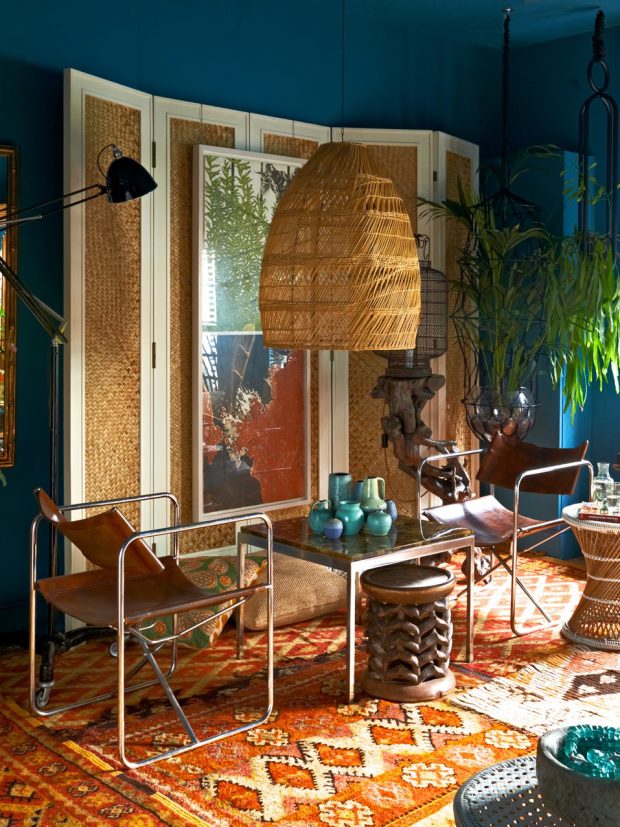
In a room that champions bold colour, make sure that other elements of the composition can stand their ground. ‘even though the pendant light has been dramatically overscaled, due to the nature of its materiality and loosely woven reeds - it becomes diaphanous.’
When it comes to lighting, opt for pieces that are out of the ordinary. ‘Playing with scale and colour – especially in unexpected ways – is a simple way to riddle the senses. Bold hues have the power to transport
visitors to an almost Alice in Wonderland-like world.’
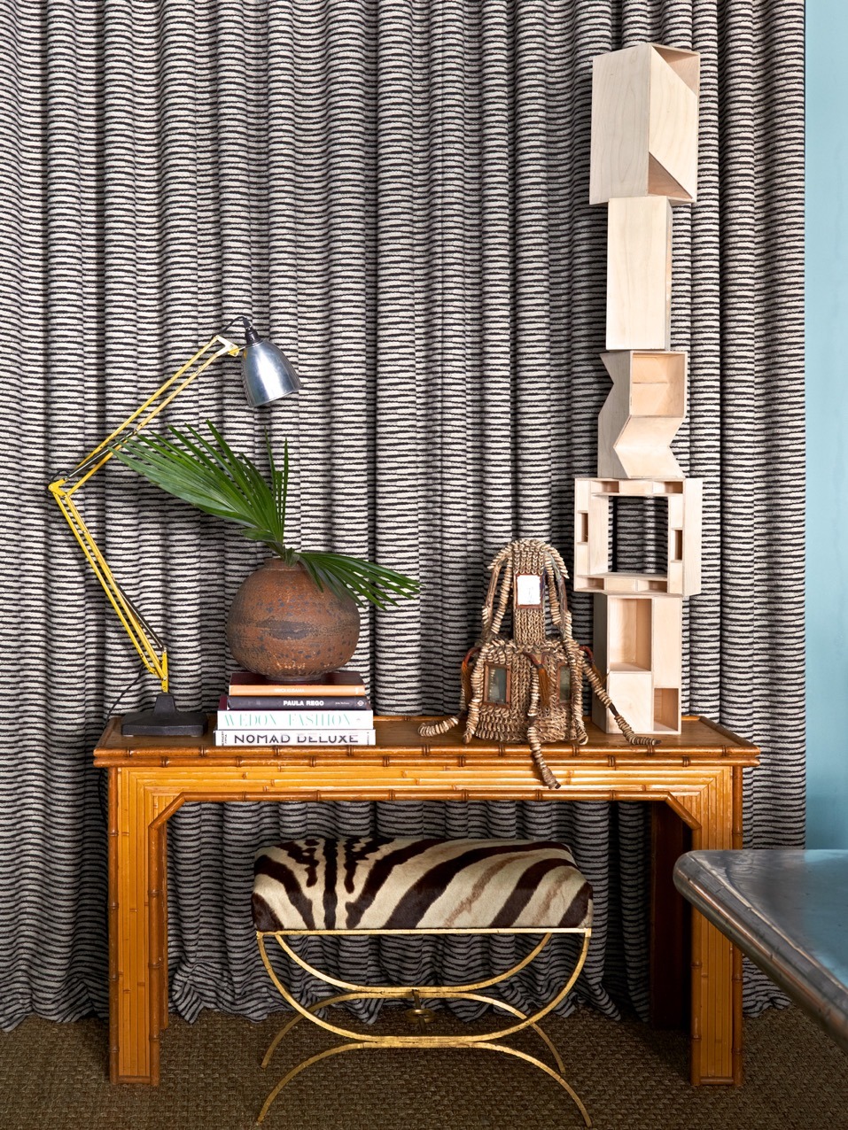
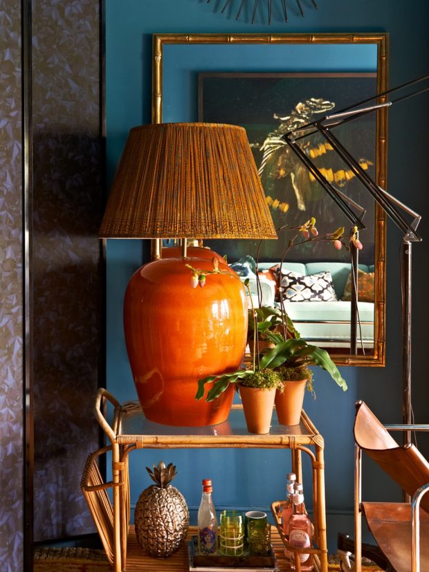
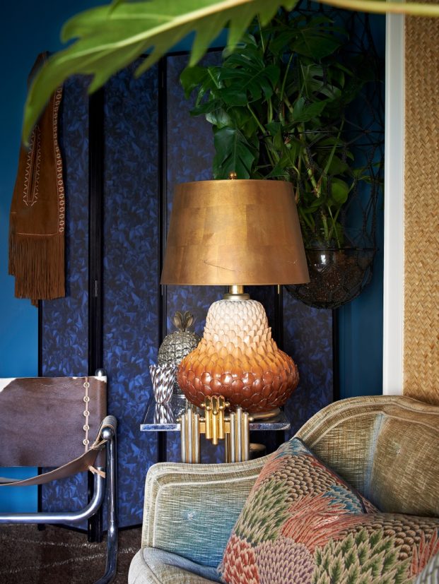
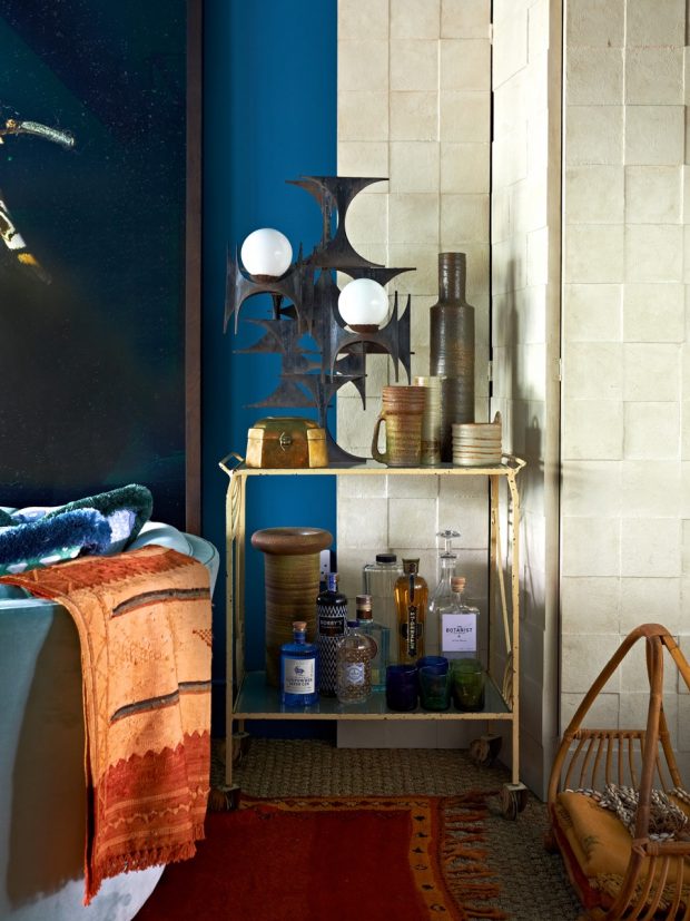
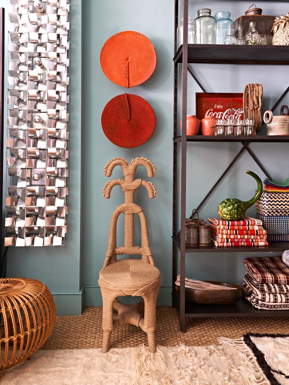
'It's one thing to have objects stacked on shelves or tables, it's an entirely different thing to have them interact with each other.' Moments of micro-decorating, or lifestyle vignettes, make a space feel considered and lived in and evoke an immediate sense of comfort.
Beige and cream are not your only options. ‘Our goal was to create custom deep blue and aqua green paint colours. It was about finding shades that are neutral without being the conventional understanding of neutral tones. They’re a magnificent foil for a host of bold tones.’
‘Don’t be intimidated by more sophisticated, unexpected tones. When grouped together they balance each other out.’ The colour combinations here are especially effective as they’re played out against a black screen, which really emphasises the uniqueness of the hues.
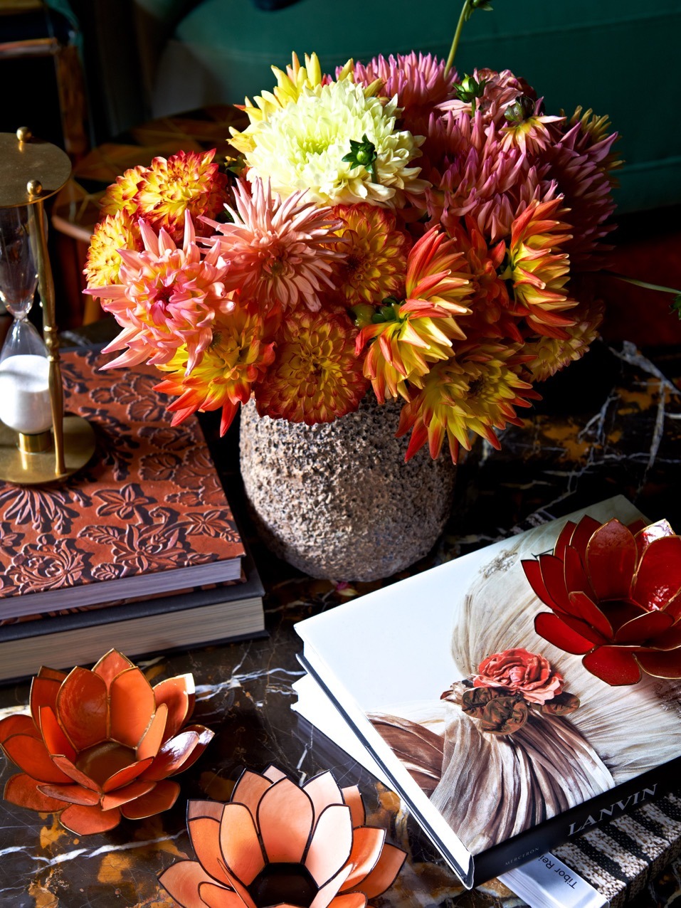
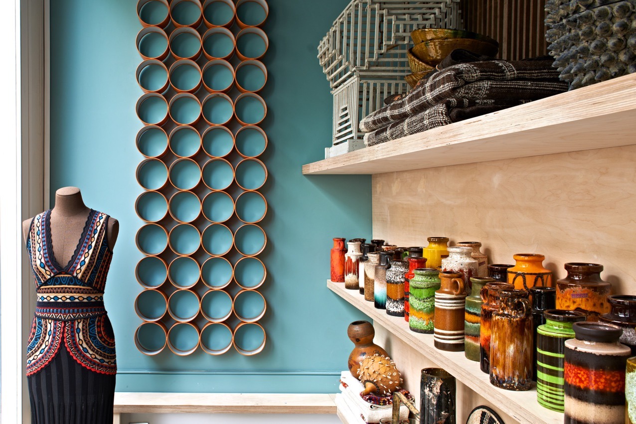
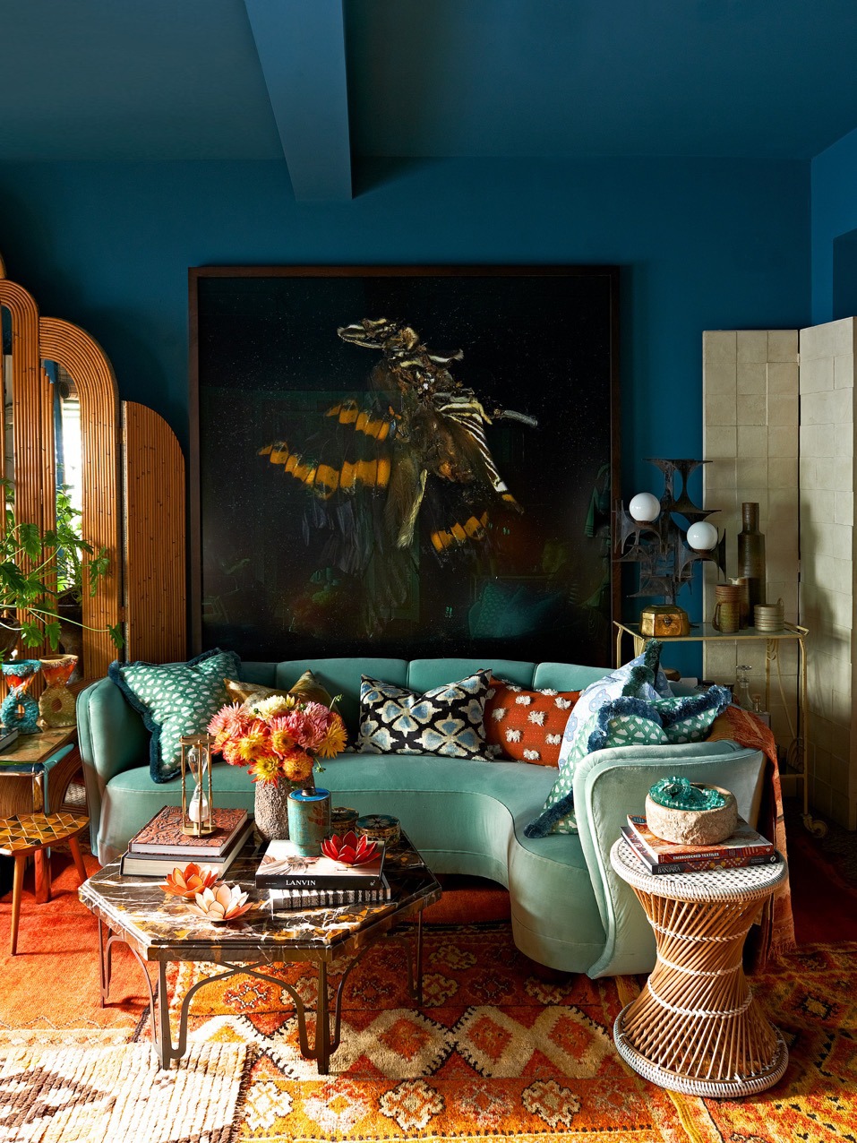
Use colour – especially darker tones – to make a space feel more intimate. ‘If there is a lack of architectural detailing, such as cornices, extend the painting of the wall colour to the ceiling. By losing the natural break you cosy up the space.’
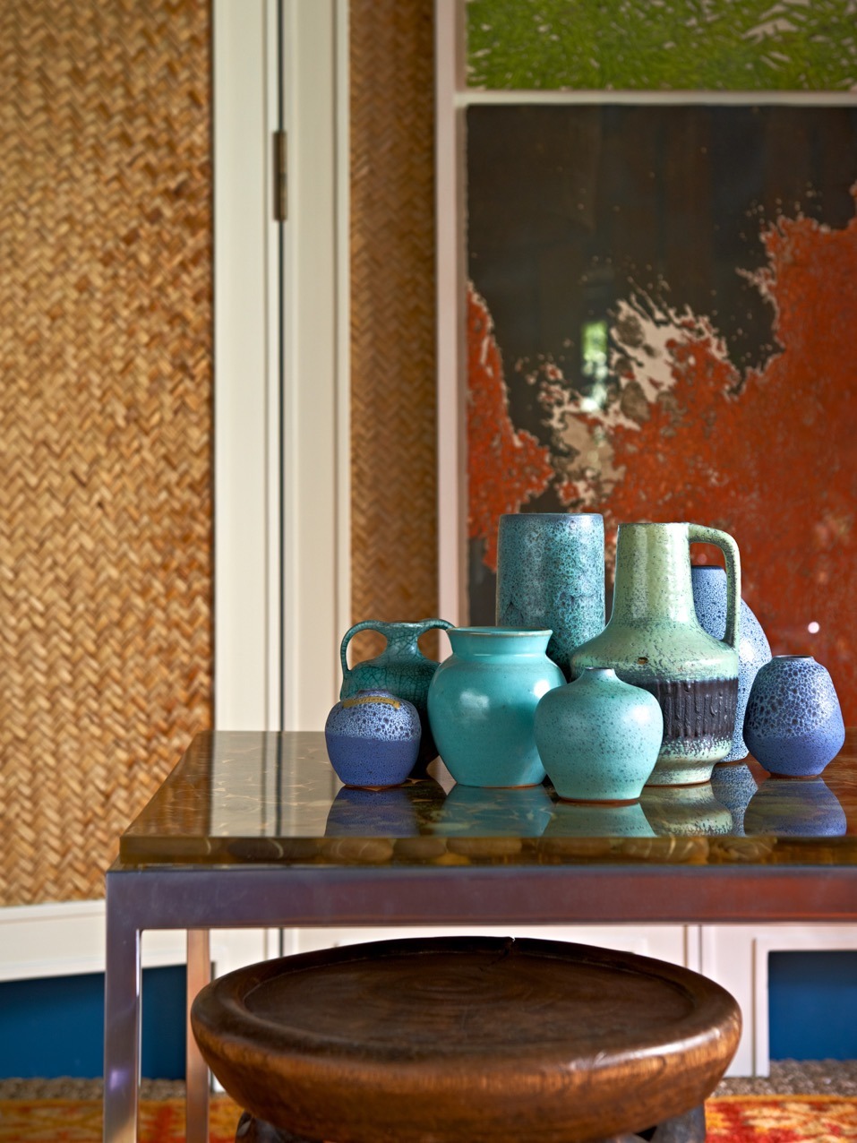
‘A single colour goes high impact when it’s played out en masse. Ceramics in varying tones and glazes make for a powerful colour play.’ Ceramic s are also the ideal medium through which to express colour grouping as they’re easily accessible and on trend.
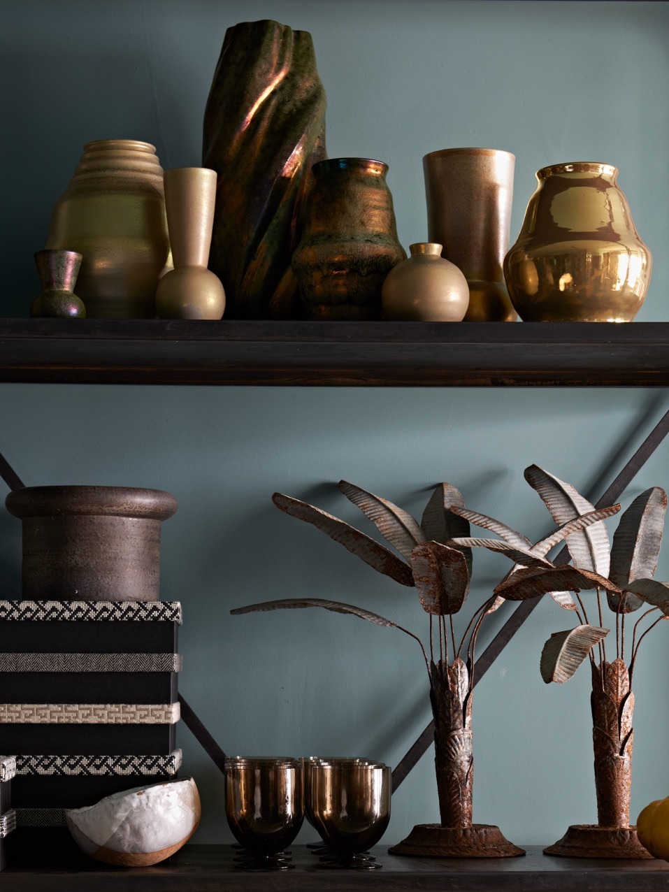
‘Metallics are the jewellery of the room. In this case we contrasted the lustre of the gilt-glazed ceramics with the more textural, rusty pieces.’ On the industrial steel shelving these pieces add a wonderfully glittering addition, really ‘popping’ against the blue-green wall colour.
Much like screens, curtains are a brilliantly simple way of designating different areas and adding splashes of pattern and colour. ‘The fluted nature of eyelet curtains adds architectural detail. Curtains also conceal unsightly fixtures – more affordable than structural changes.’
‘The layering of rugs – here over a more neutral seagrass – adds a bohemian, very exotic, feel. It’s also a brilliant way to play with different colours and patterns.’ Buy rugs of different sizes and overlap them. This approach is particularly effective in ultra-modern spaces in need of soul.
It pays to shop with a collector’s eye, honing in on pieces that tell a story. ‘If you build up an inventory of pieces that are interesting and soulful they’ll look good anywhere and infuse a space with a sense of history and personality.’
