Monochrome
There is a dynamic energy that comes from working with monochrome. You can feel its presence in the bold, freehand strokes of Chinese calligraphy as easily as in the subtle nuances of poetry on the page.
When it comes to interiors, it’s the little black dress of decorating: elegant, nonchalant, unflappable and brilliant.
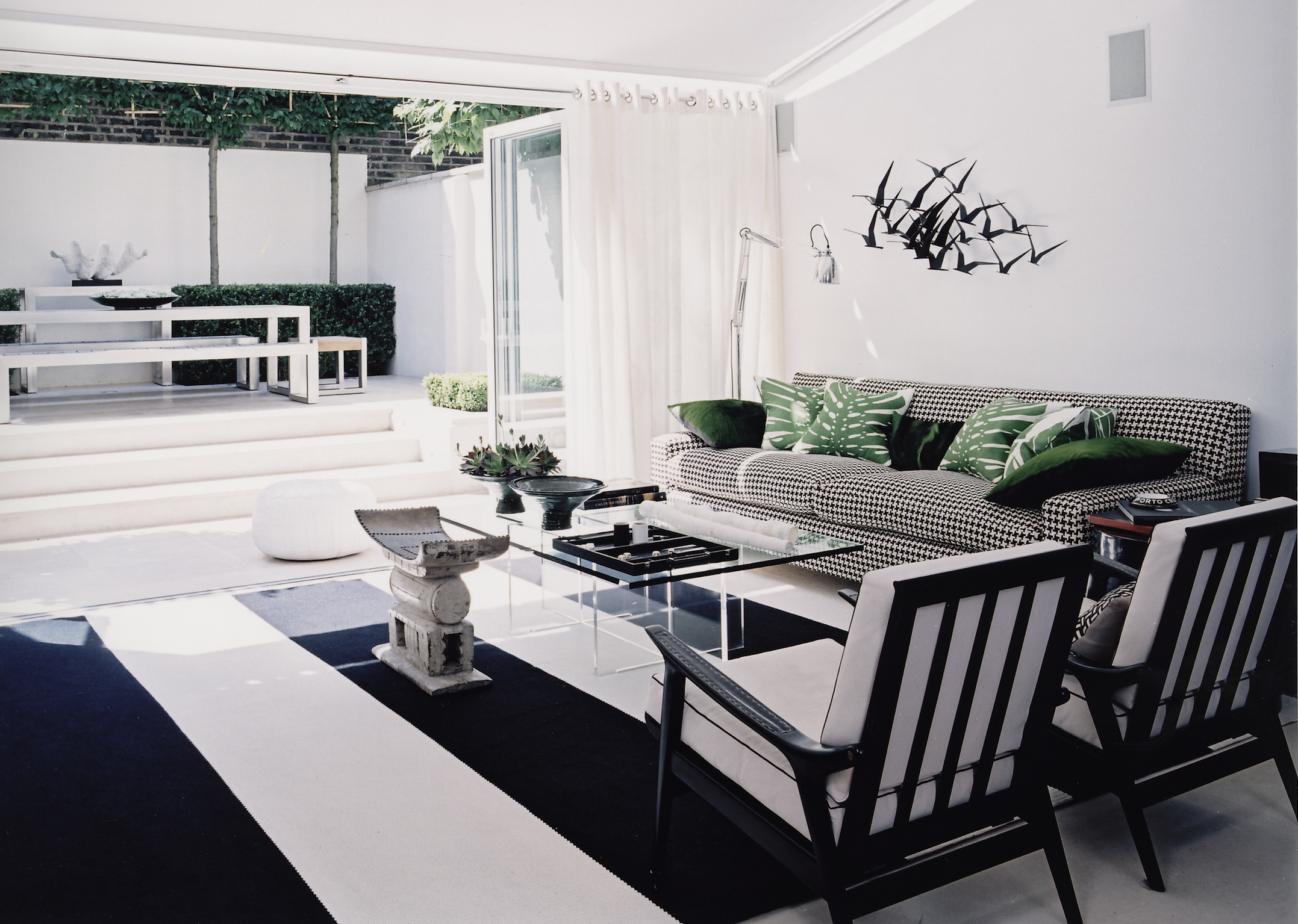
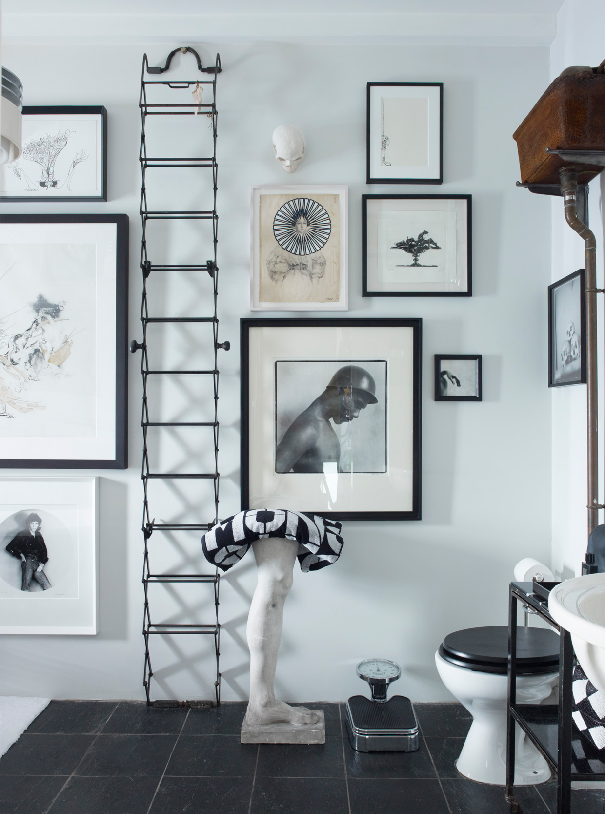
“…a simple yet highly effective visual equation that essentially cannot fail to deliver an impressively cohesive interior scheme”
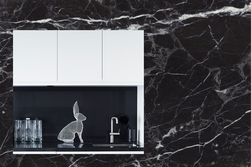
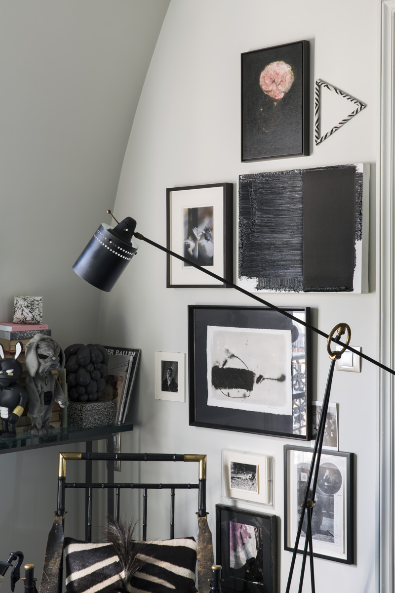
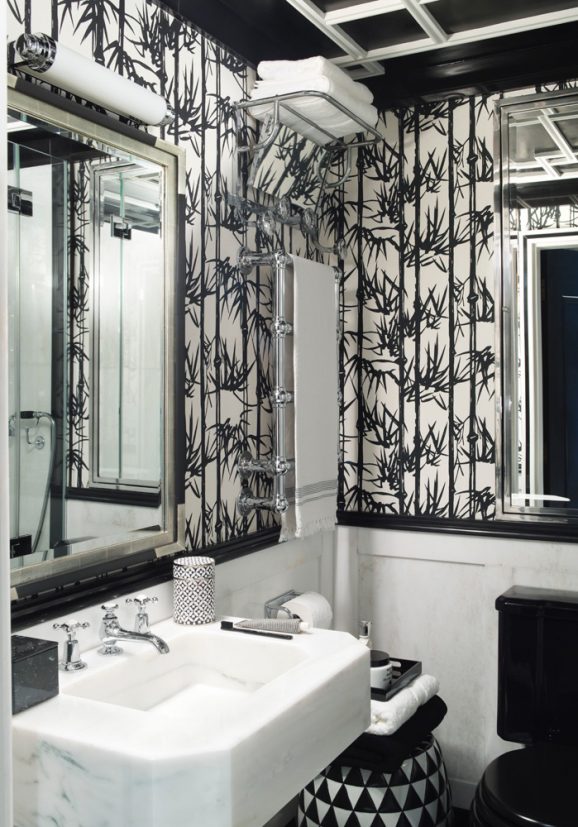
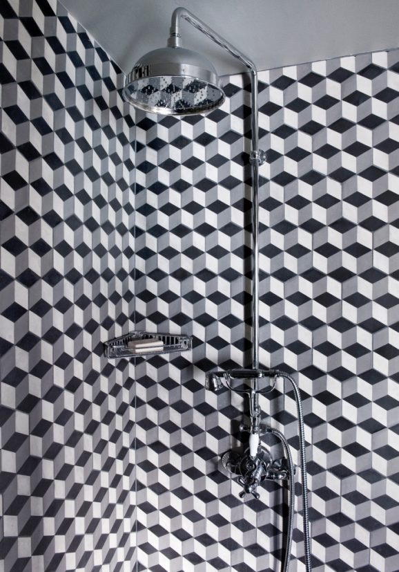
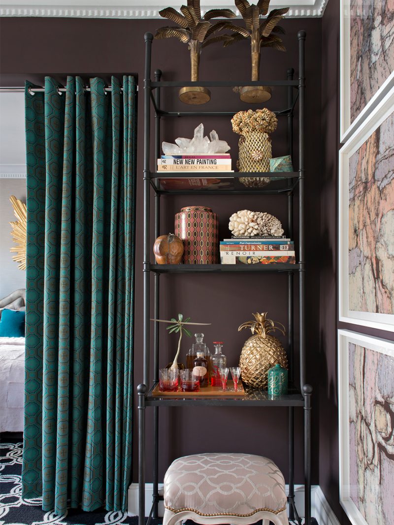
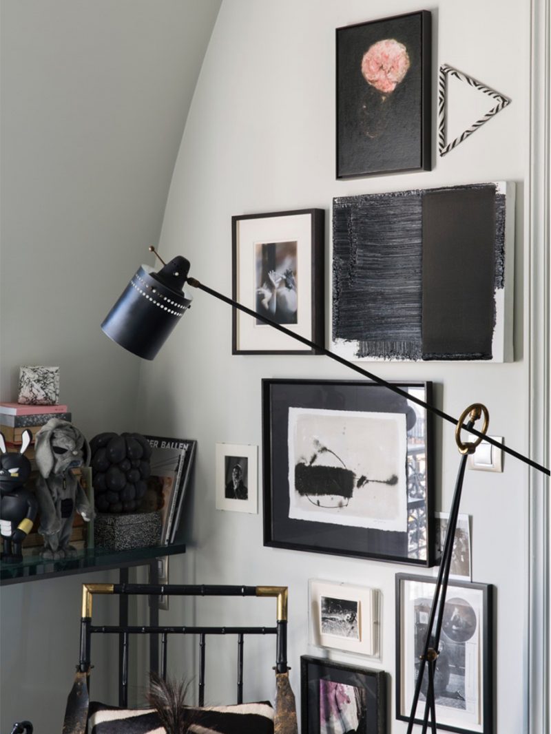
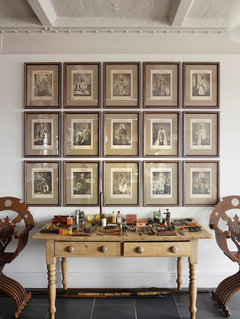
This is an opportunity to make daring design plays with little risk of failure, where the ‘more is more’ approach will really pay off; think pattern-on-pattern layering, graphic use of geometrics and contrasting elements such as tile and grout colour. In this way, the real beauty of monochrome lies in its ability to be complex yet restrained and calm at the same time. It’s a simple yet highly effective visual equation that essentially cannot fail to deliver an impressively cohesive interior scheme. Floor and wall tile juxtapositions aside, monochrome is also the perfect medium within which to mix photographic and art pieces, so long as they stick to the black-and-white brief. Unified by mutual neutrality, it becomes much easier to collect and curate the pieces as a whole that can be displayed en masse in a salon hang. Every new layer adds to the greater whole while the restrained use of colour keeps the decorating grounded and controlled.
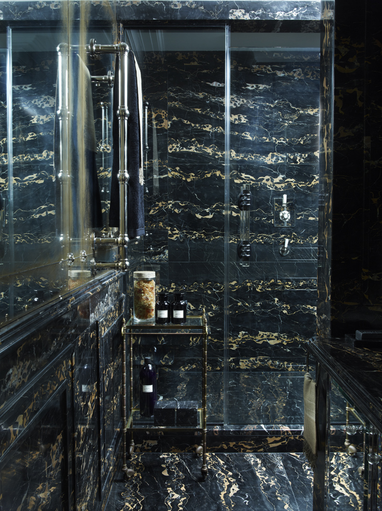
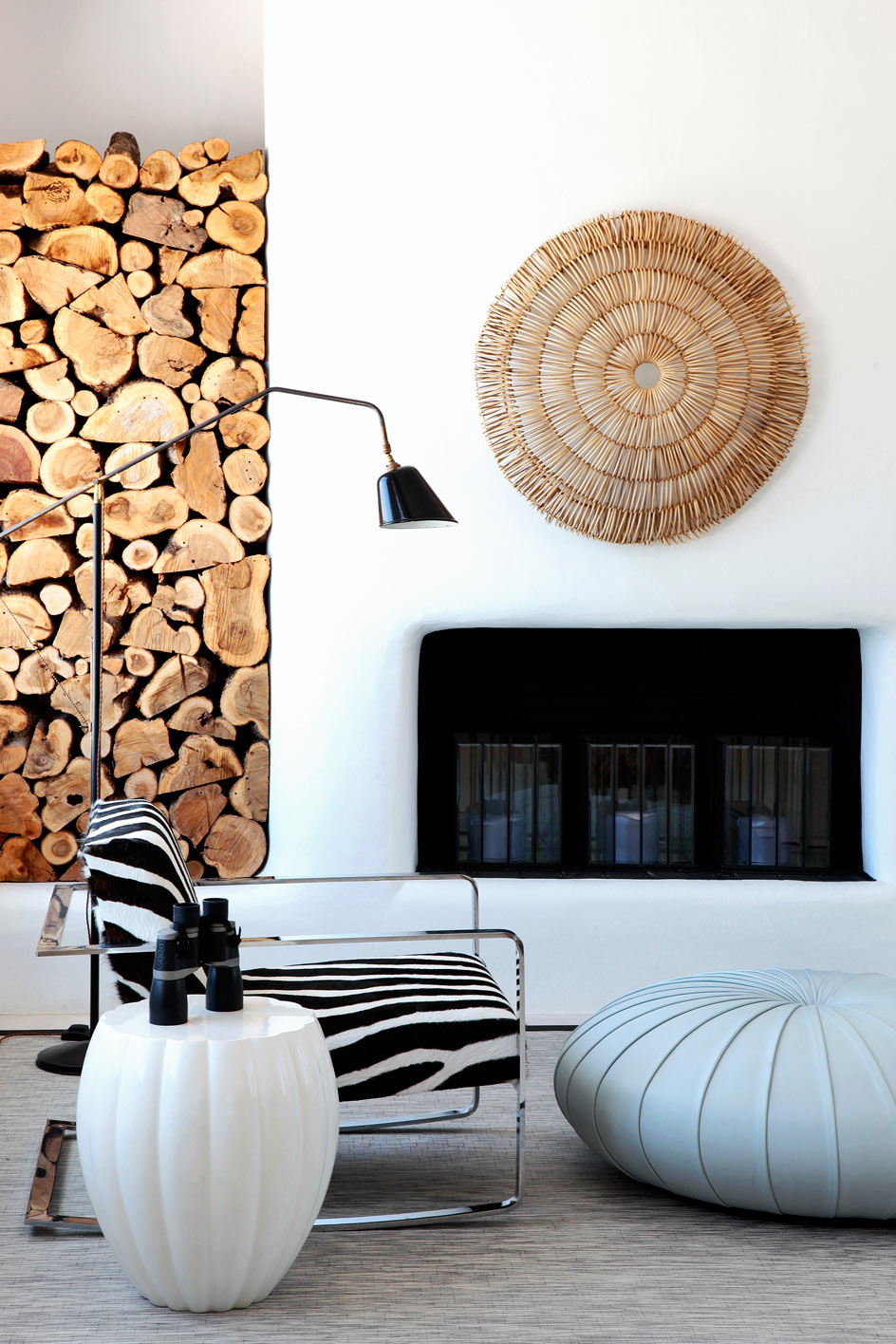
Texture is another crucial aspect to take into consideration when decorating with a monochrome palette. Consider mixing different materials in a variety of finishes – aggregated stone, rough slate, smooth marble or polished granite – to create a highly tactile experience with maximum visual impact. The salient quality of textured materials is their ability to add inviting warmth to a space regardless of how bold or graphic their appearance. Consider, for example, the modest metro tile: gently chamfered for softly geometric texture yet it adds an instant punch of bold geometry.
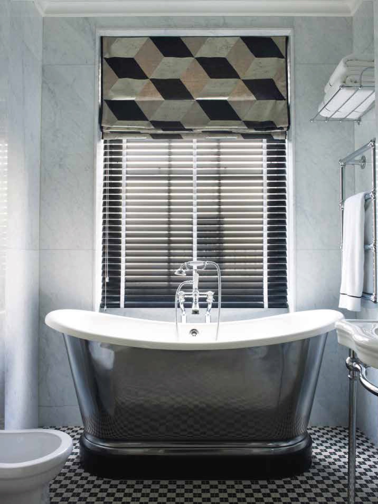
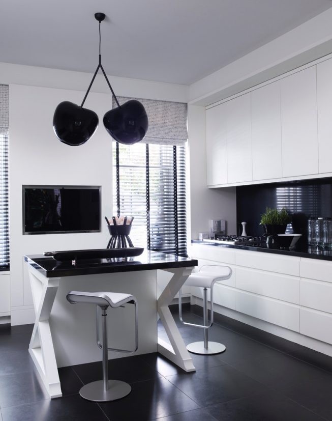
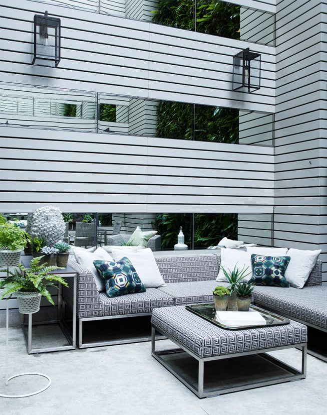
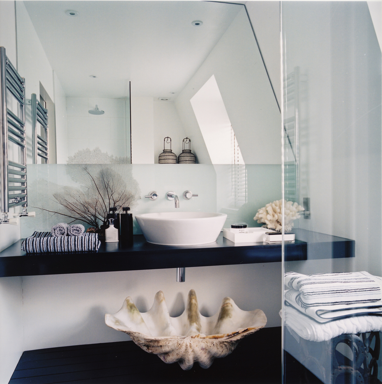
"Texture is another crucial aspect to take into consideration when decorating with a monochrome palette"
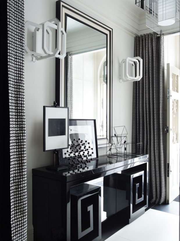
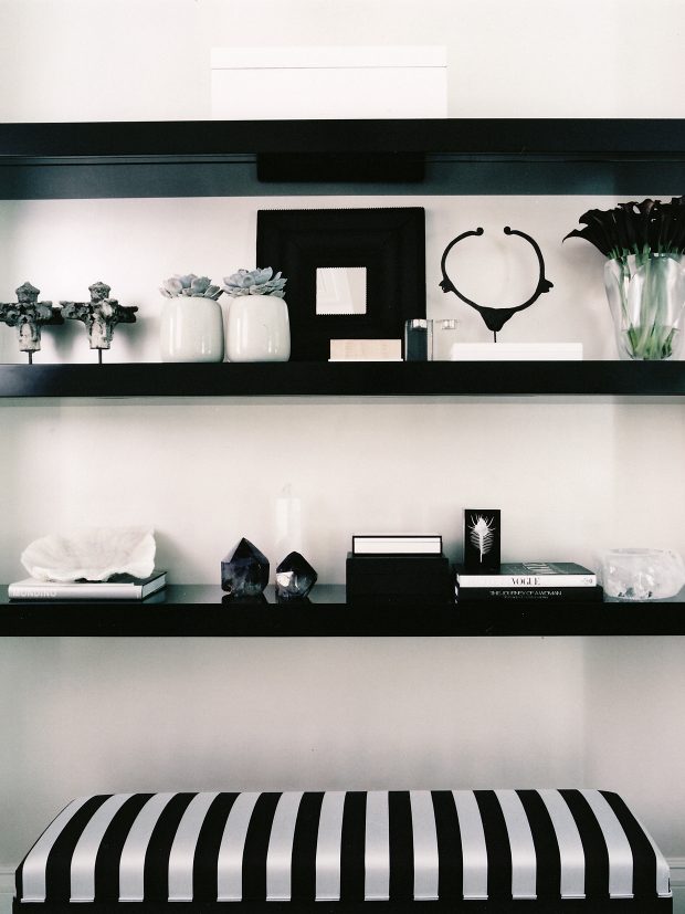
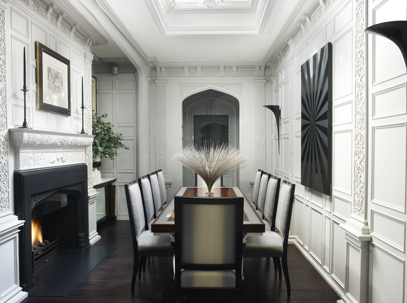
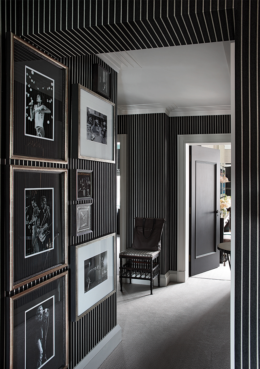
Monochrome is a highly preparatory design medium, which makes it very effective when employed it more transient spaces such as entrance halls, bathrooms and even kitchens rather than rooms you’d be predisposed to spending longer periods of time in. That being said, a room in only black and white should not be a jarring experience but, almost counter-intuitively, it should leave you feeling relaxed. Opt for an earthier, more soulful approach when decorating with monochrome as it can easily come across as too slick and mathematical or too harshly Brutalist. Do this by placing emphasis on organic forms and natural materials, especially ethnic artefacts and pieces that carry with them a sense of depth – the perfect foil to the historical connotations of an industrial aesthetic.
Simply put: monochrome is a high-speed, high-impact decorating medium. The effect is always bold and graphic, but with a lot of room to play with subtle texture and pattern layering. It’s also a clever way of upping the value of a space without the heavy budget implications, which is perhaps why a pared-back palette approach always comes across as free of pretention but still confidently secure in its visual expression. Strongly architectural, easily adaptable, infinitely customizable – with just a little know-how, decorating using monochrome is always a stylish solution.
